A card built to match the design receives a portrait image and 200 characters of body text from the API. The Figma wireframe says nothing about that case.
I gave a talk about what frontend development has taught me. This article restores the context the slides could not hold, following two threads: design edge cases and animation performance.
Design for edge cases together
A wireframe in Figma does not always contain enough information to make an implementation decision. Designs often use representative screen sizes and data, leaving the behavior of unusually long text, images with different aspect ratios, and narrow screens unspecified.
When an engineer fills those gaps by guessing, the result may drift from the design intent and require rework. This is not necessarily a failure by either discipline. It is information between a static design and a dynamic product that has not been shared yet.
Consider a card populated from an API. The leftmost example may represent the expected state, but real images have different aspect ratios and text can be much longer.

If the display area matters most, object-fit: cover can crop an image. If showing the entire image matters most, object-fit: contain can preserve it and allow empty space. The right choice depends on the content and the product.
line-clamp can keep cards to a consistent number of lines, but truncation raises more questions: is important information hidden, and can someone reach the full text? If the complete value remains visible, long words and URLs still need a wrapping strategy.
These are not inherently bad data. If the system accepts them, they are inputs the UI must handle. Upload constraints can help, but those constraints must not prevent people from completing their goal.
We resolved these edge cases by comparing the real output together. We shared cover and contain examples on screen and discussed concrete line-clamp cases in Slack. A specific example creates a much better decision than an abstract request for the missing design.
Not every case has to be perfected in one sprint. A team can implement representative states, review the working UI, and carry the findings into the next iteration. Accessibility and data-loss risks are different: requirements that make the product unusable or unsafe should not be deferred.
Better communication across disciplines
Designers and engineers bring different expertise, but share the goal of creating a good experience. That difference is a starting point for combining evidence, not a barrier.
Engineers reason from HTML, CSS, and browser constraints. Designers bring visual principles, user research, and business requirements. When the reasons behind a decision are shared, a technical limitation can lead to an alternative that preserves the intent instead of a superficial imitation.
For user-generated content, include representative states such as long text, empty values, different image ratios, and errors. Even a small decision, such as whether a checkbox or list marker needs a custom appearance, removes ambiguity during implementation.
Engineers can also do more than request another design. Show feasible options and their tradeoffs. A comparison of cover and contain helps the designer decide and creates a reusable rule for the next feature.
A product is not one person’s artifact. We turn ambiguity at the boundary between design and engineering into shared understanding through conversation and concrete examples.
Improving user experience
The first part of the talk overlaps with Improving Images with Core Web Vitals. Rather than chasing Lighthouse warnings as a checklist, measure the cause in Chrome DevTools. Here I will focus on the animation example from the second half.
Animation performance
The Performance panel shows how much time the browser spends in style calculation, layout, paint, and compositing.
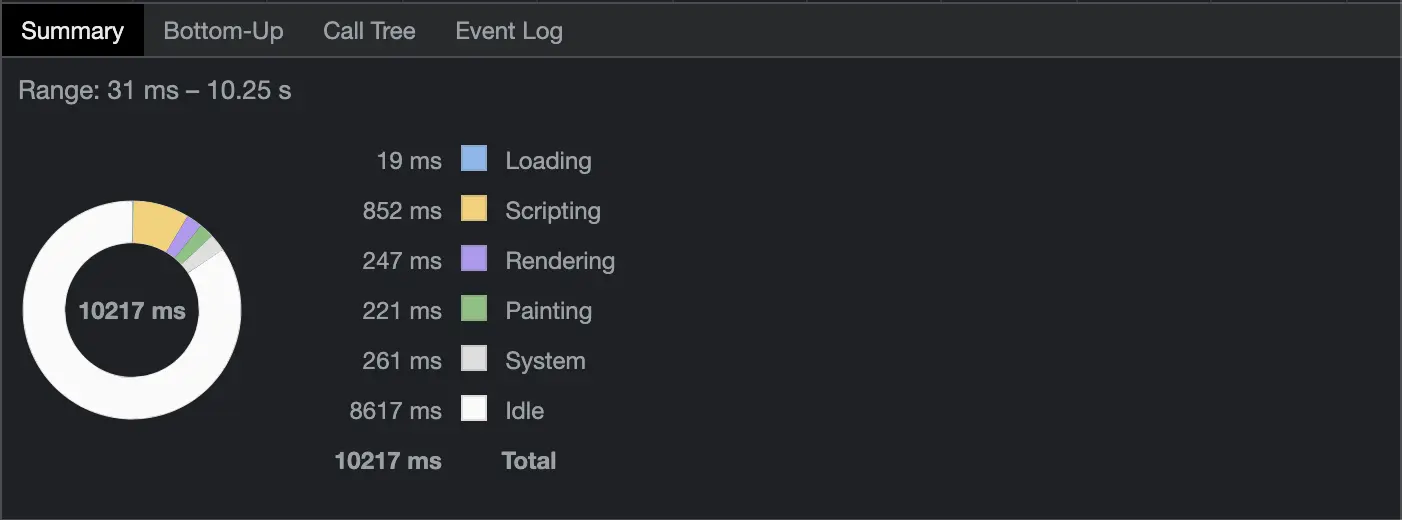
Animations can affect several stages of the rendering pipeline. transform and opacity do not require layout and can often be updated during compositing, which makes them good candidates for moving UI. They are not guaranteed to create an independent layer, however; measure the actual page on representative devices.
Animating left can repeatedly trigger layout and paint.
.container {
  position: absolute;
  width: 240px;
  height: 240px;
  background-color: rebeccapurple;
  animation: slide 3s infinite;
}

@keyframes slide {
  from {
    left: 100%;
  }
  to {
    left: 0;
  }
}
The Event Log shows the repeated work.
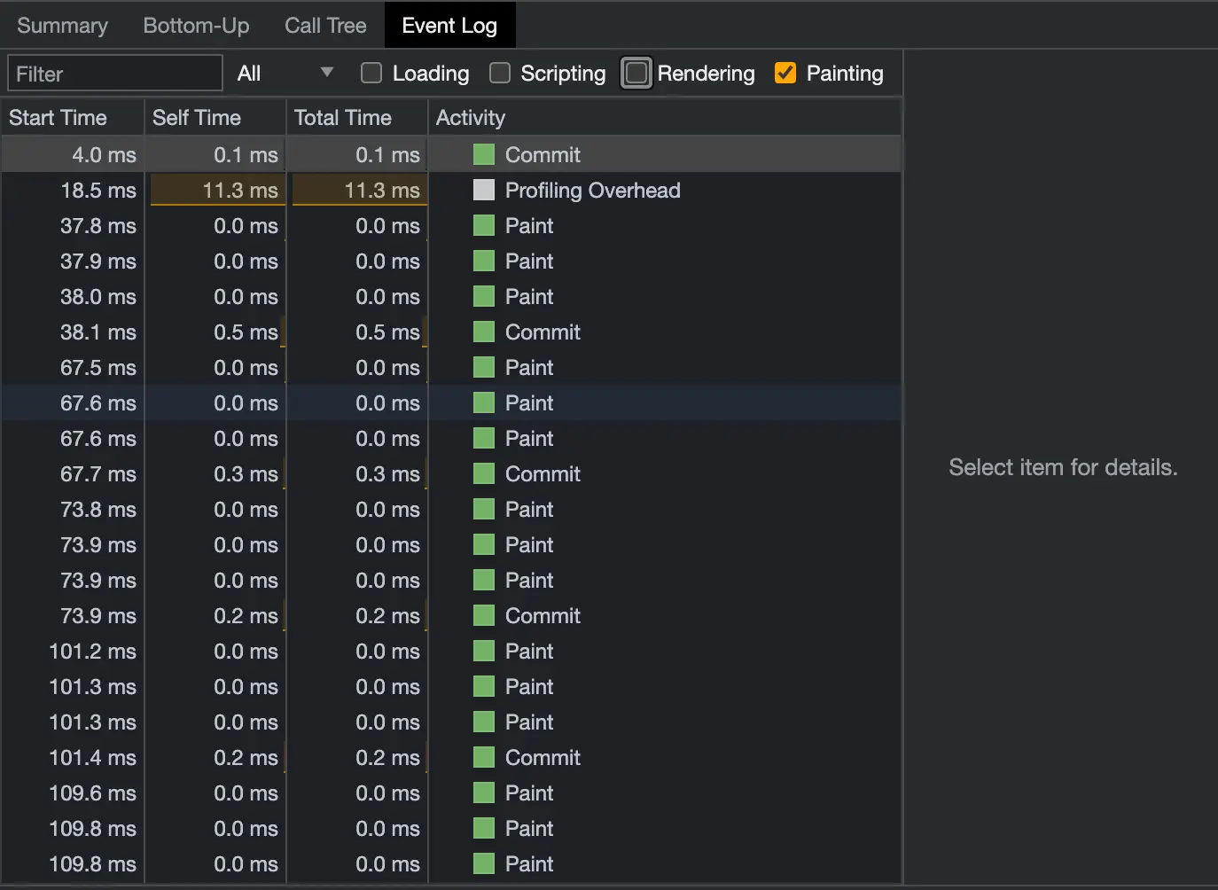
Expressing the same movement with a transform can reduce that work.
@keyframes slide {
  from {
    transform: translateX(100%);
  }
  to {
    transform: translateX(0);
  }
}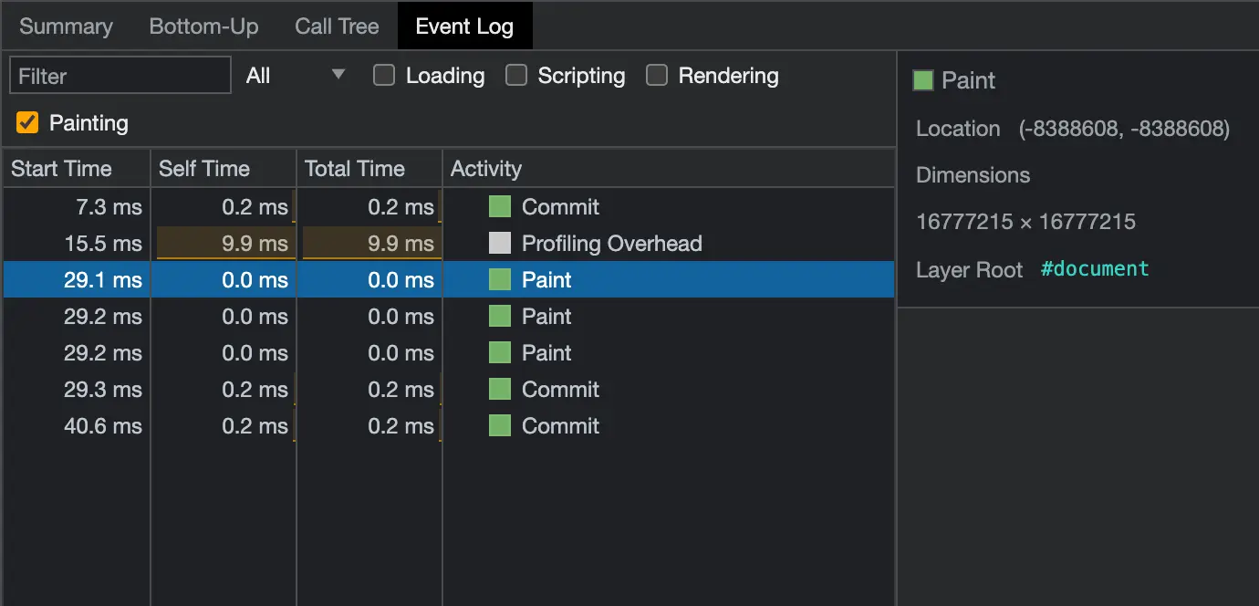
When the browser can promote the element to a compositing layer, it can move or fade that layer without repainting unrelated content. More layers are not always faster: they consume memory and have management and compositing costs. Avoid applying will-change broadly. Limit animation to what adds value, measure on target devices, and support prefers-reduced-motion.
Closing note
There is no universal answer for how to crop an image or build an animation. The two examples here share a method: look at concrete output, measure what the product actually does on a real device, and choose the tradeoff that serves the experience. Repeating that is what gradually raises the quality of the product.